A hot topic these days are grid based designs. Why you may ask? Well, grids create a solid structure for which to lay a strong visual layout, not only this but a great grid based website can make a more usable site. Below we will discuss the beginnings of grid layouts and where they will lead us.
We will look at effective uses of grids, and why and how they are used within web design layouts. We will also uncover some great resources that will help you along the way, as well as some awesome grid based websites out there today.
Introduction to grid design
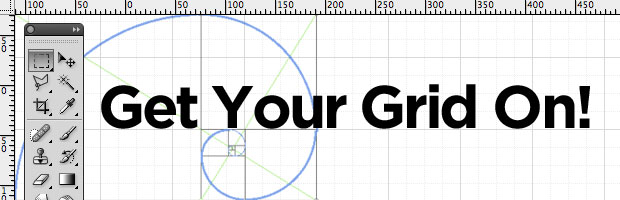
Grids have been around for longer than you might imagine. Remember
Leonardo’s Golden Ratio? Or perhaps the Rule of Thirds in photography? You might ask what this has got to do with grids. Well they are all based on ratios and a solid foundation of which to base a structure on. Knowing your ratios can be the difference between a good site and a great site. When constructing a design not only do you have to take into consideration aesthetics, but also proportions and grids can help you order your graphical elements of text and images.
Where did grid based designs come from?
Grid based designs were happening long before you may realize, with Leonardo Da Vinci’s Golden Rule essentially working with ratios, proportion and grids. This has shaped the way for such designs based around structure and form.
Then there was an art movement called
Constructivist Art which originated in Russia. In this movement grids were redefined and restructured, the movement brought more geometric themes that were broken down to their most basic forms. Around this era grids were emerging into a bigger art space where it would affect typography and commercial design through giving us a better understanding of the fundamentals of ratios.
Effective uses of Grid designs – Why use grids and why are grids so good?
While grids where being used effectively in print through the typographic grid, web designers and developers were struggling with inconsistent design and code practices. With this the grid came an effective way to strengthen our skills and grids are being suggested for use in design more and more each day.
You might feel that grids have nothing to offer but it can help speed the design process and assist you in making decisions such as how wide should I make this column? Or where shall I place the icons?
Why Use Grids?
Some might think the grid restricts their designing ability leaving no freedom for creativity, no fluidity. That may be the case, but then you might be looking at grids the wrong way! The grid is there to help you create logical structure for which it creates aesthetic value in your work. It’s a framework for you to find that balance between a formal structure and the freedom of creativity.
Grids can be used for any design aspect, from photography to typography to even scrapbooking! The grid facilitates creativity by giving designers a foundation on which to assist in the development process. Grids are becoming a big movement within web design, with such CSS frameworks as
BlueprintCSS and
960 Grid system, they have reduced development time and created a better framework for designers to work with in creating a more wholesome, balanced, aesthetically pleasing website.
For the designer, grids help organize our elements by creating a balance between our elements and distributing everything in an aesthetically pleasing manner. Grids also help us design for growth, updates and additions to the site. They allow us to organize the sections better for development while also allowing for fluid designs to break through.
For the viewer what grids achieve is an easy structure in which to absorb the content and message by allowing for easy usability throughout the site. Sites that many have a lot of content especially benefit from grids such as Newspaper websites like, BBC or NY times.
Grid design resources – the know how sites
There many resources for designers and developers to access for grid systems and templates, some sites include:
1.
The Grid System
2.
960 Grid system
3.
BlueprintCSS
4.
Golden Grid CSS
5.
1kb Grid
These sites provide information, templates and CSS frameworks on which to work on for great grid foundations. Let me explain a few of these resources so you can grasp a better understanding of each of their strong points.
Now the main difference between the grid systems in the list is that they can be separated into CSS frameworks and general resources and grid templates that you can follow. One main point that each serves to illustrate is that grids are there to assist in your creation of a wholesome site, not to curb the fluidity of the design and creativity but to enhance it via the use of a foundation to work upon.
One great resource to start with is TheGridsystem.org. Here you are provide with not only great advice and articles but a whole range of templates in which you can download and start to work with in Photoshop, Illustrator or Indesign. I found this site valuable in the knowledge it gave to enlighten me on the uses of grid design.
960 Grid Systems is great if you are essentially working with 960px. It provides templates, CSS framework, HTML layout generator and helpful advice for implementation for your site. A good quote from the site explaining their purpose is:
“The premise of the system is ideally suited to rapid prototyping, but it would work equally well when integrated into a production environment”
Blueprint is a CSS framework. Its main purpose is to cut down development time, similar to 960.gs. Its ease of use is great for those wanting only a quick easy CSS framework to grab and use.
The Golden Grid CSS, is a CSS tool for simple, easy grid based websites. It works off a 960px, 6 or 12 column grid system, another easy to use tool.
Lastly there is the 1kb grid, and you guessed it its lightweight (1kb) but packs the punch of a hearty, full on grid system for you to work with. Its great slider tools let you adjust the column width, number of columns and the gutter width before you unpack the code so it’s easier and less of a hassle for you to change the measurements of it in the code.
Examples of Awesome grid based sites
Before you start your next Grid based website layout, we've rounded up a collection of totally awesome grid based websites that you can use for your inspiration. Take special note of how they layout their elements on the page and align everything to a grid.
Bunton

Converge SE 2010

Creative Sessions

Dribbble

Eric Steuten Design and Concept

G 1

Mark Boulton

RVLT 2010

Snagly

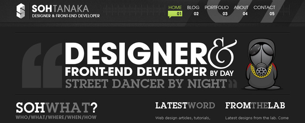
Sohtanaka
The Import

Typographic Posters

What do you think?
Do you have any other awesome examples of beautiful grid based design? Anything we missed? Please let us know in the comments below!