With buds forming on the trees and buttercups emerging from underneath the green blanket of soil, it’s no wonder the new season inspires us to incorporate soft hints of pastel colors into our designs. But when exploring this lighter color scheme into your designs, you still want your design to “pop.” Here are some tips to creating light designs that still grab the attention of onlookers.
Tip #1: Set the mood
The use of color is powerful! They are the aspect of art that evokes and sets the overall mood of a piece. So that’s why it’s so important to take the time to decide which feelings and emotions you wish to convey to viewers before creation of your piece has even begun. Many times, pastel designs are created to provide a bright, refreshing feel. But the pastel colors present can further define the emotions felt. Here is a list of the emotions generated from select pastels.
• Blue: Conveys trust, patience, peace, stability
• Yellow: Provides a feeling of liveliness and happiness
• Orange: Shows cheerfulness and creativity
• Green: The color of nature; inspires life and growth
• Purple: Associated with wisdom, royalty, or magic
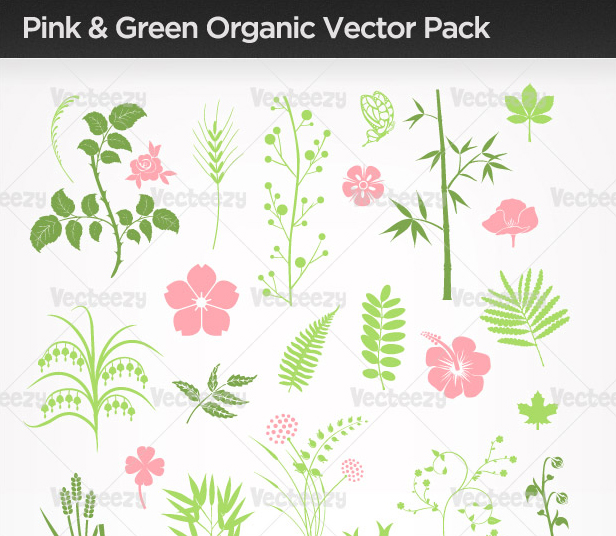
• Pink: A very feminine color that evokes romantic or tender emotions
Tip #2: Refine your color scheme
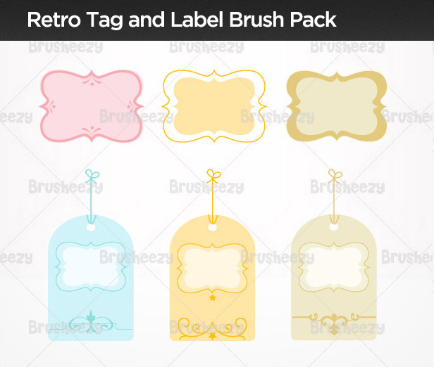
Depending on the mood you wish to set, it may make sense to create your design solely around one color or center your design around two or three. If you decide the use of one color will work best for your design, then try using three or more shades in the same color family to add interest to your piece. You can also use overlapping layers of the same color, each set in a different transparency, to create the look of multiple colors.
If you wish to convey a set of emotions, multiple colors are the way to go, and pastels naturally compliment one another. For most designs though, we suggest using a maximum of three colors in your design to ensure the calm, cohesive feel of pastel designs is preserved.
Tip #3: White space is essential
Incorporate lots of white space along with your pastel colors. Pastels are best used in small concentrated amounts. Think about it – colors are much more eye-catching when kept to sections rather than scattered throughout in small amounts.
Tip #4: Add punches of color
Avoid a “washed out” appearance in your design by incorporating darker shades of the primary pastel hues present. But preserve your light design by utilizing these darker shades in very small amounts. These varying degrees of shades will work together to make your design “pop.”
Tip #5: Have fun!
Remember to have fun. Putting too much pressure to abide by design rules can sometimes cause our creative thoughts to come to a halt. So relax and enjoy your time designing! We promise – your designs will thank you.
Check out these soft and subtle pastel Premium packs to get started with these tips!


View More Premium Pastel Files Now!
Pick up pastels with these free art files available to use:


